What makes an effective design? We’re always concerned about typography, colors or graphic elements and sometimes we don’t pay the right attention to the composition and harmony “rules”. I mean, the composition is frequently based on what we feel it’s right, but there are some tricks to make it more precise. We are going to understand the design and composition elements and its arrangements.
WHAT IS COMPOSITION, AFTER ALL?
Composition is basically the arrangement of shapes, colors and elements in order to guide the reader’s eye making him understand and remember it, also looking pleasant. As we always say, there are no real rules for design, but there are principles that fits for most works. Don’t be completely restricted to what we say here, but know how to use it in your projects.
DESIGN AND COMPOSITION ELEMENTS
These following elements are the ones we must pay attention when making the composition of a layout.

Color is a strong element that can create harmony, contrast, define spaces and much more. Besides that, colors can express feelings and sensations, so be careful when choosing them. Last week we published a complete article about color theory which you can see here and learn more about color harmonies, color wheel, warm and cool colors beyond other things.
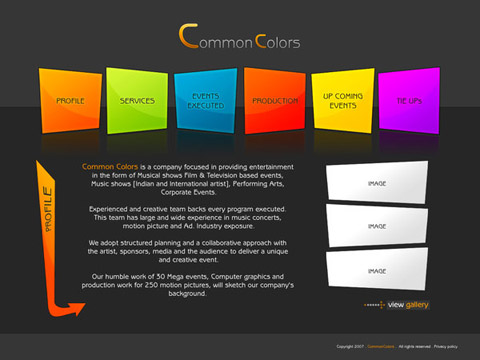
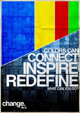
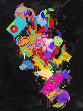

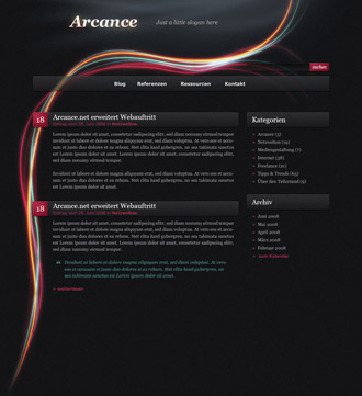
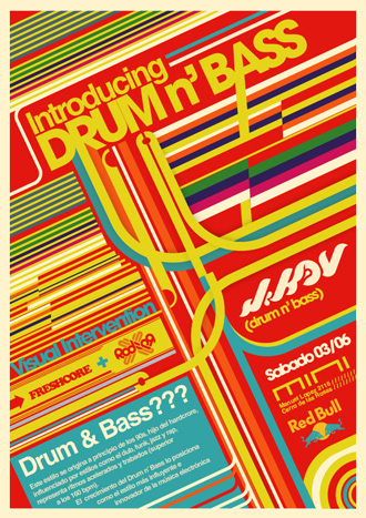
This element is important to indicate movement and make the layout flow. Being straight, curved, horizontal, vertical or diagonal can mean different things. The important thing is know how to use it, being explicit or not. Take a look at the images and see how the lines create a nice flow in different designs.
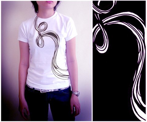

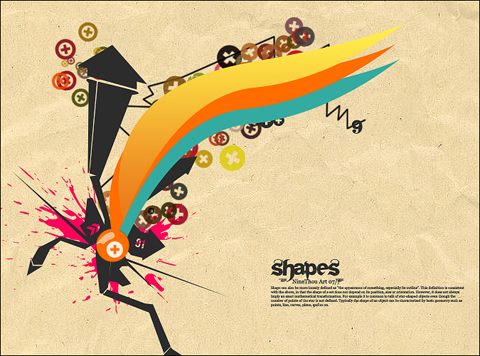
Shapes are closed lines and like these ones, shapes can indicate movement, as well as balance the composition and distribute weight. The primary shapes are basic geometric figures, but it’s just the beginning. The organic ones can make great compositions, due to its infinity of forms.
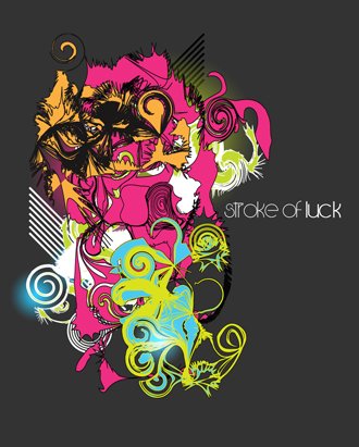


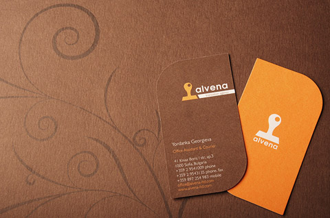
The texture refers to the feeling you have about a surface, like rough, smooth, etc. It’s also related to repeated pattern on a surface. Using a nice texture can make your work much more rich and interesting. The images show texture as a surface and as the whole image.
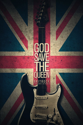
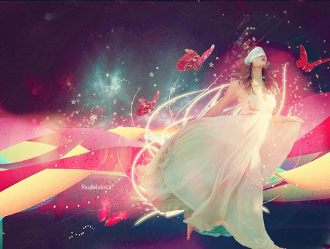
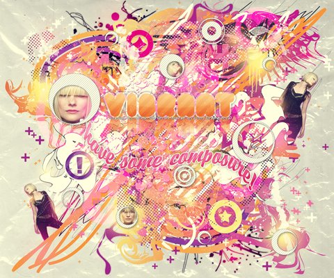

Tone is about light and dark and how they give volume to the image, giving a three-dimensional quality. It doesn’t mean that it’s only referred to black and white, but also for colors.


We call proportion the relation of size/weight of elements in a layout. That’s what keep the balance. Talking about proportion and composition, we must remember the “Rule of the thirds” and the “Golden ratio”.
Rule of the thirds
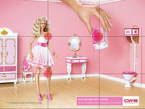
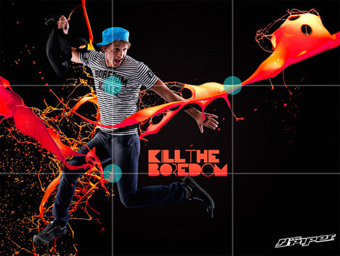
This rule is pretty well known, specially by photographers (nowadays many digital cameras displays the rule of thirds’ grid). The image is divided two horizontal and two vertical invisible lines. The intersection of them is the point of attention, where should be the important elements. See this rule in application in the ads below.
Golden Ratio
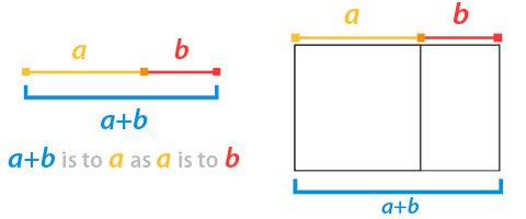
The golden ratio is a mathematical constant approximately to 1.618, represented by the greek letter phi (Φ or φ). We can see this ratio when the proportion of the sum of two parts and the larger part is in the same proportion than the larger and smaller parts, like the image below explains. Besides the equation there is a golden rectangle, which is its application.
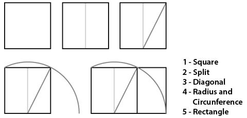
You can make a golden rectangle with paper, ruler and a compass creating the exact proportions.
Studies indicate that we are programmed to see this proportion as comfortable and pleasant. There are also speculations about some Da Vince’s paintings, saying that they are based on these proportions. Just for curiosity, the pentagram is based on this proportion. Think about these proportions when creating a layout, even if you want to completely disobey them, it’s always important to have the knowledge to do that.

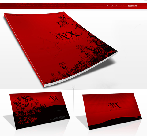
The unity is the characteristic that makes all components of a layout work as a single piece, talking it the same language, keeping a pattern or style. You can easily notice that, for example, in a kind of illustration in a layout (1), the unity of colors (2) or the unity of elements (3) as you see in the following images.


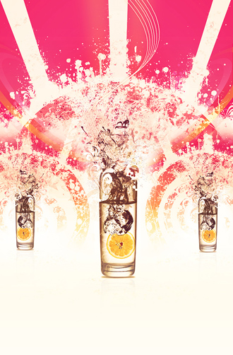
The balance is a property of distributing weighs in the space. Being symmetrical or asymmetrical is not the point, it depends on your whole composition. But you need to know that if you want to keep the balance, you must place carefully “lighter” and “heavier” elements. You can see below balance using: many elements around the main shape (1), dividing the weigh with the logo and element (2) and a horizontal symmetrical distribution of elements (3).



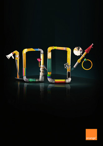
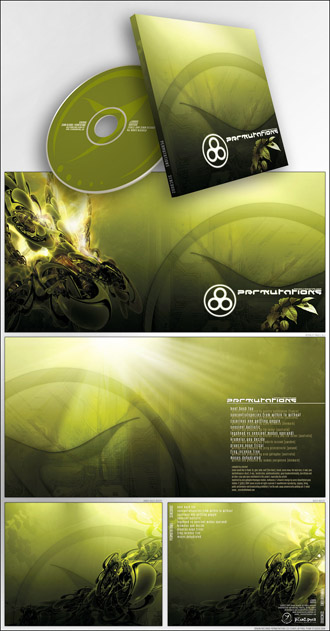
The positive space is where the shapes and elements are. All the “empty” space around it is the negative space. Don’t ever think that the negative space isn’t important, because it’s an element as any other – that’s why designers always talk about “white space”.
Conclusion
The balance of all these elements presented here are supposed to make a good composition, but most important than any rule is using your own perception. As designers, we know that each project has its particularities. Experiment, provoke, try something new for every project. Now you tell us other aspects to consider when making compositions, besides the ones in this article.

great article. learnt something new today
Nice article, and some great examples. At least this was a productive way to procrastinate this morning.
@Erik You are welcome erik. I wish I could procastinate in a procductive way all the time.
Effective is a very important word. There is a lot of thinking and talking that is concerned with understanding a situation or with describing a situation. From such understanding, perhaps action can be taken.
Great article. Lots of good examples and the topics were concisely but adequately explained. I plan to refer quite a few folks this way.
This is also a useful tool for working out Golden Ratios
http://goldenratiocalculator.com/
Nice article! Agree on how important negative space is. For a design to look good, there should always be some “breathing space”. Really good examples too.
Cheers!
Great walk-through, thank you. It’s one thing to look at a great design and another to really understand why it is so appealing.
Thank you guys for all the feedback, we make all these articles hoping that they will be really useful for you. The idea of this one was make a clear and simple explanation, which is hard to find in articles about general composition. Thank you all!
These are great examples to show. My favorite is the beer one and the girl in black and white.
I like them.
Very Ineresting and excellent designs
Thanks for sharing these great examples.
@Sharyn you are very welcome 🙂