Text, typography, fonts, typos… This is a complex world that all designers are involved in. Today we’re going to talk about this important communication tool: typography. We’ll cover aspects like anatomy, categories, adjustments, tips about where to find them, useful tools, tutorials and a lot of other resources and information.
ANATOMY
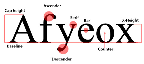
Here is a simple representation of the most important parts of a type anatomy, such as serif, ascender, descender, counter, x-height and more.
CATEGORIES
Most of the (Latin) fonts can be classified in one of these categories. Let’s see some definitions and characteristics.
Old Style
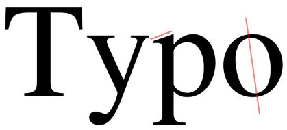
Old style fonts are based on antique written with feather pens. They usually present low contrast between thin and thick strokes, diagonal axis and angled serifs.
Modern
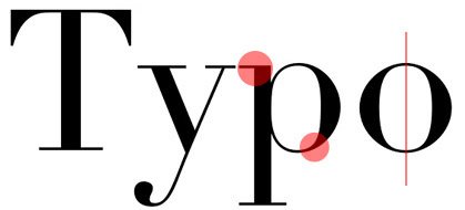
More mechanic than the previous one, the modern types still have serifs, but thicker ones now. Big contrast between thin and thick strokes, vertical axis and straight serifs.
Slab serif
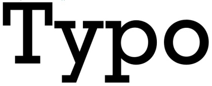
The types becomes thicker, and so do the serifs. In this style, there’s too little or no stroke contrast.
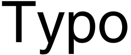
Sans serif
This kind of types has no serif and no big stroke variations.
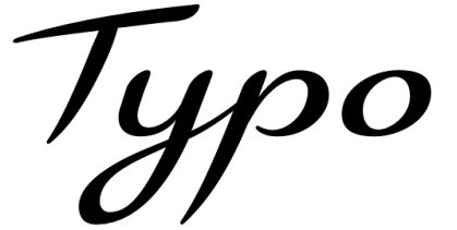
Script
The script fonts try to simulate different kinds of handwriting. They can be based on brush, pencil, pen, ink and other kinds of writing.
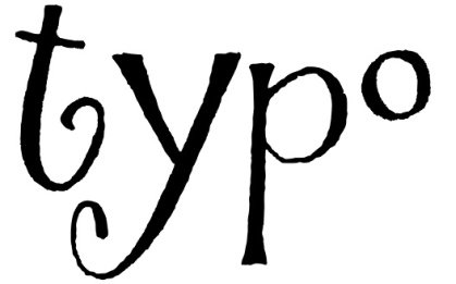
Decorative
Any kind of different, irregular, funny or exaggerated fonts can be called decorative. They are mostly used for titles and solo words, never for long text.
TIPS – IMPORTANT ADJUSTMENTS
There are some adjustments that make a text more legible and harmonic. We’re talking about leading, tracking and kerning.
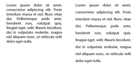
Leading
This is the space between lines. The default leading in general is 120% of the cap height, which means that there is a little space between the lines. If you need a lighter text, easier to read you can increase the leading. If you have a small area for your text you can make adjustments decreasing the leading, but be careful to keep legibility.
Tracking and Kerning
Tracking refers to the space between all characters, while kerning refers to space between specific characters. The second one is a fine adjustment, specially used for titles or logos. The image below shows different tracking adjustments:
![]()
This other image represents the variation of kerning values:

TIPS – WORKING WITH LAYOUTS
Some simple tips for your layouts: Alignment, Contrast, Proximity.
Alignment
You can use any alignment, as long as it’s the adequate to the layout. Long texts, for example, should not be centralized, it makes the reading a lot more difficult and boring. You can try left alignment or a justification, but don’t let the space between letters or words be too big for justified texts.
Contrast
One of the most important principles to make a text more interesting and hierarchical is contrast. Titles should be pretty different than the text. Even using the same font, you can set a bigger size and choose a different family like bold or italic. If you are going to use different typefaces, be sure that they have contrast. Don’t use different serif fonts in the same layout. Make the difference evident.
Proximity
The words and texts from the same “category” should be together. Like we see in business cards, for instance, the contact information is not spread through the card, it’s together as a group.
TOOLS
For creating and working with fonts.
Fontstruct
Powerful tool to construct your own font online.
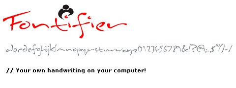
Fontifier
Transform your handwriting in a font.
Your Fonts
Transform your handwriting in a font.
Type Tester
Visualize and compare typefaces on screen.
What the font (My fonts)
Useful tool to find fonts simply uploading an image.
Font Exlorer X
This one is not an online tool, it’s a great font manager from Linotype.
Font Lab
The Font Lab software allows you to edit and create fonts.
WHERE TO FIND
A selected list of sites for comercial and free fonts.
- My Fonts
- Veer
- Linotype
- Fonts
- Font Shop
- T26
- Ascender Fonts
- Smashing Magazine – Fonts
- DeviantART – Fonts
- DaFont
- Urban Fonts
- Abstract Fonts
TUTORIALS
- How to: Make a Hand-Drawn Font
- So you want to create a font – Part 1
- So you want to create a font – Part 2
- How to make your own fonts
- How to make your own font
- Photoshop text effects tutorials
- Photoshop Text Effects Round-Up: 51 Text Effect Tutorials Every Designer Should See
- PSDtuts text effects
- Create a Spectacular Grass Text Effect in Photoshop
- Watercolor Text
- Digital Arts
- Illustrator Tutorial: Dynamic Burberry Text
- New Year Creating a New Typeface in llustrator
- Create a Dream Design with 3D Typography
ARTICLES
- Typography Toolbox
- The Principles of Beautiful Typography
- On Choosing Type
- 25 Font-tastic Type Resources for Web Designers
- The New(er) Typography: Counterless, Bold and mostly Geometric
- A Guide to Web Typography
- 40 Super Sleek Fonts for Clean Web Design
- 10 Web Typography Rules Every Designer Should Know
- 50 Most Extreme Free Grunge Fonts
- Top 7 Fonts Used By Professionals In Graphic Design
- Your own handwriting on your computer!
- Top 10 (Web Safe) Blogging Fonts
- Five simple steps to better typography
- 10 Common Typography Mistakes
- Don’t Be Afraid of Serif Fonts
- Fonts and the Web
- Fresh works from leading creative professionals in Typography
- Using Pixel Fonts

i’m fonted out after reading that! got a bit of a headache! there are so many resources to get fonts, create your own fonts i never knew existed. i wondered if snap2objects could help me with a small problem? i need to get the font Din Schriften but i am too tight to pay for it! do you know of any similar free fonts?
sorry but i have just no money!
@Gaz Hi I was trying to find a free version of the Din Schriften but did not have any luck sorry 🙁
Thanks! This is just exactly what I needed.
@Aartje You are very welcome
@mao
thats ok. i love the font so much that i just might stump up the cash!!!
I’m a little late, but just wanted to let you know that this is an amazing article. Well written, constructed, and with great links and examples. I’m bookmarking this page for sure.
@nick glad you found it useful 🙂