
We have been talking about avoiding clichés lately, instead trying to reflect the unique personality of every business. That way our design will stand out among millions.
Sometimes the hardest situations come when our clients ask us to implement some not-so-unique elements and it seems almost impossible to convince him that it would be better to take another direction in order to differentiate his business.
There’s nothing wrong with the use of a specific image (or design trend). The problems come when we use them gratuitously, without asking why it should be there and if it is really conveying an honest portrait.
I will show some images I consider overused, since the beginning of the web, that could make your website (or any design) look generic, unimaginative and dated – if you use them just for the sake of it.
The handshake

This is one of the most classic business images on the web. There are countless websites and brochures with similar photos. The irony resides in that clients still ask for it. We should show how this image is overused if the idea of the client is to show a “confident”, “trustworthy” or “friendly” values. Then you should show other ways to convey that emotion with the use of other images, color palettes, and patterns.
The Call Center

This is another classic. I can’t remember how many clients have asked for this kind of picture, when the vast majority don’t even have a call center, or a single free line. And you can see all around the web these many unavailable live help services – giving nothing more than frustration to the clients.
The Globe
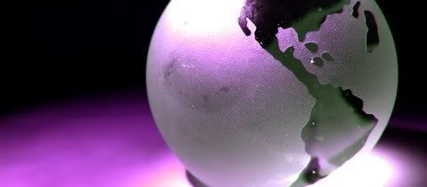
Does the company have any branches? Do the attendants speaks several languages? Does it have international clients? If the answers to the last questions were “no”, “no” and “no”, then you should reconsider why you want to give the international feeling to it.
The world in your hand

Same three questions from the last image. No, no and no?
The enter Key

Is it a design for a hardware related company? Maybe not. Maybe there is no need to sell keyboards–or use this image in the design. You may agree with me that you should think twice before using it.
The Clouds

I love to use “organic” elements in design. Clouds are always refreshing, but try not use the image on its own – try to give it a twist, to add some extra elements, maybe a kite or red balloon.
The Skyscrapers
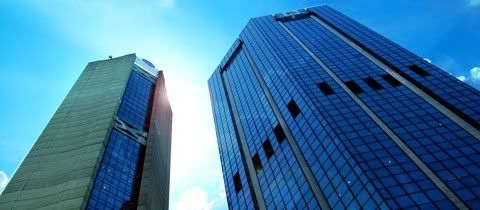
The skyscraper image is another resource to communicate the idea of “power” and “internationality.” I find it very useful, as well as the use of city skylines. But consider using something more human and warm if the company you are working for is not that big.
The random media

This kind of image, any close-up of hardware, is widely used. But their use may give the design a “technological aura” that transmits the wrong idea.
The @ simbol

The @ symbol is a true gem. At least the spinning @ is not in fashion anymore.
The Group of professionals

The “we” instead of the “I”. Why show d vast group of professionals when it is a one (or two) man show?
Conclusion
Trying to avoid clichés is always hard work, not only in the pressure we can face but also in the temptation to offer a cookie cutter design just to give the client “what he wants”. That’s why we should always question the use of any element in our projects – why we are using it? What do we want to communicate? Is there another way to do it? Is it faithful to the business personality?
What other images do you think are over- and/or misused?
Interesting and valid points.
Speaking of uniqueness though, this and subtraction.com seem very similar :):)
Using a lightbulb to express an “idea” – ahhh I hate that one!
indeed, but this only scratches the surface of the onslaught of cliche brought about by the advent of cheap and decent quality stock photography combined with the poor taste of the small to medium business owner.
@Daniel, indeed they look very similar, going to talk with Chris Pearson about it LOL. I think that happens when you use a free wp theme. Is about time I design my own. Well but at least gimme credit for the headers and the images for the post 😉
What about irises? the eye that I guess means that the company “Looks Forward” or something like that. Those irises *always* belong to a blue or green eyed person. I wonder if someone in order to avoid cliche uses a plain dark brown eye, or maybe a Sith-like red iris? anyone?
Nice article. It reminds me of how often when clients request for certain visualisation of ideas, these are the images that come into mind whether like it o not.
Also the time when clients when discussing on how they want their site to be, they describe just these (images)! It s kinda funny when they actually describe it in a manner as if they are great ideas of their own.
Even greater problem would be that sometimes no matter how creative we tried to be different, the client insisted on having the same old idea that everyone been doing. It is sorta let down.
Funny. The impressions we can make with stock photos.
I don’t know how many times I’ve been to a website and seen the picture of the drop-dead gorgeous tech support chick or the group of friggin-happy workers and wonder, “Does that girl really work there? If I call, will I get to talk to her?….Did they snap that picture of those laughing people at break or something? Why are they standing in a line looking so smug?”
As valid a point as you make, I don’t see any of these effects going away. Why? Because they do the job required.
Good point!
I didn’t realise it before but these are indeed horrible cliches!
Whenever I see stock business photography on a website I get the urge to commit mass genocide.
Great points. Any suggestions for what to use as alternatives to those photos?
I always get business oriented sites demanding I use imagery similar to what’s above but at the same time want their message / site to state: “we’re different than OTHER businesses”…very frustrating.
@Devin a guest blogger made an excellent talking about the importance of the personality of your site
. Worth a look
Ugh. That alleged Guy-Smiley doctor who looks suspiciously like the call center guy above. He wears his stethoscope like an Olympic gold medal. I’ve seen him on three different sites listed as three different doctors.
Good list. I agree with pretty much all of the ones you chose. A lot of those have been played out since 2000, 2001 and people *still* insist on using them.
The call center is my fave. I can think of tons of times that i’ve seen the same operator images displayed on tons of different sites!
If you’re going to use extremely played-out stock imagery, please pick one that’s not all over the internet already.
lol these images are very common. I think it’s also because they are just so easy to find on stock image websites without too much imagination required.
I think you forgot the waterdrop (e.g. as seen here: http://www.piscinasgallegas.com/Waterdrop0.jpg ). Why? Because (at least in my country) almost everyone uses it – from medical doctors to car distributors.
Damn yeah!
I thought it eas just me that noticed the over use of these images.
The call center and the skyscraped ones just reek of ‘out of the box’ inprofessional hosting companies.
It’s difficult to take seriously “style” comments from someone who can’t even proofread their own copy to catch the numerous grammatical mistakes:
“if use them just for the sake of it” – hunh?
“The irony resides in that clients still asking for it” – Without verb, even
“Does the attendants speaks several languages?” – Whats ifs theys dos?
“Is a design for a hardware related company?” – Is a complete sentence?
“Why show and vast group of professionals” – it was just and idea…
All of which brilliantly illustrate the reason people use immediately-understood images on a webpage – to eliminate the need for the error-prone thousand words needed to convey the same meaning.
Phil From Loreauville had it right – they do the job – they work – the customer asks for them. The plain image as shown in the above examples are clichéd, but used as a source within a Photoshop montage, or taken from a different or new angle they can still work.
Let’s look a them:
1) The handshake – this one is very over-used – so how about taken from below? New angle – new perspective.
2) The call centre – get rid of the grin and a row of call centre operators back – the image then says they are WORKING for you, not just looking smug.
3) The Globe – almost as bad as the company logo in the shape of the country they reside in – uuugh! But I get away with it by the old grid slice and dice. Slice it up and move the bits around like a Rubics cube (don’t get me started on using a Rubics cube to illustrate complexity!)
4) The world in your hand – instead, use as part of a montage – add elements in a colour palette that matches the palette of the page.
5) The enter key – once again – montage is your friend – add overlays to increase the complexity of the message.
6) The clouds – easy – I always invert the meaning of the clouds – add them to the screens on a PC to replace the blank look or a boring spread sheet. Have them appear inside a house’s windows. Go Surreal.
7) The skyscraper – use with a more interesting foreground image, like shaking hands taken from below!
8) The random media – even CDs are old hat now as we all just download – I like to do a piss-take and add floppy’s – you know 5 1/4″ ones – that cures the client’s need to see CDs.
9) The @ symbol – it works – even the image shown here is more creative as it just suggest the symbol. The mouse looks dated though! Same with old IBM PC keyboards or a one-button Mac mouse. Don’t go there people!
10) The group of professionals – these should only ever be seen on real-estate web sites – the faceless bastards that are ripping you off. Better to show people actually working – and please show a bit of mess and papers on the desk as well. These images do exist. Search deeper in your stock library guys!
11) Also avoid trying to count 11 images when there are only 10 on the page.
Computer or server with awesome design.
@Stephen Thanks very much Stephen! Excellent suggestions in finding new perspectives. Is a matter of find new angles for the same scenarios.
Chris ( #3 ) is right … avoid stock photography if you want to seem unique at all. That’s maybe not in my best interest to say as a photographer, but … stock images are well worn. They seem like a great idea, but they seemed like a great idea to the last person who used them, too…
As a designer for a software company, these are the images i am asked to use… for 2 years i use the same type of cliched images on everything… i have no choice that is what the marketing guru’s want.
Yes, stock pictures have been overused and certain ones are just cliche. However I think the mistake most people make is to allow the pictures/graphics overpower the site completely. Many designers do the same things with Adsense and other monetization programs.
Allow the text to shine. And if you want to supplement it with some graphics that’s fine. Just remember that “content is king”!
Just my two cents!
HAHA! Beautiful!
Great! I must say that you are absolutely right – also my webmaster recommended me such pictures to “show the visitors” some details about our company – but I must say – this does absolutely not show anything about the personality or the people working there – it maybe gety a touch of “ohh we do not want to show how we really look like” – Great work – I like it 🙂
Great article, cliche images can ruin a seamless design. Sometimes its hard to come up with an original concept with stubborn clients.
Oh no, I am guilty of many of these! But we are getting better with the advent of Istockphoto and del.icio.us.
I worked at some companies who had a very small amount of stock photos, so their designs where highly limited.
The design process is soo frustrating for me. I can never get everyone to agree on single design!
We had also used the handshake image, but i could convince my boss to remove it.
Wow, I think you touched a nerve here. I agree that most have these have become trite, but its hard thinking of new designs every day. I think I used up all my creativity on the first hundred designs I did, after that I think I started to look at more like a puzzle and gave up trying to make everything unique looking. Thank goodness I dont have to do that many designs anymore.
Just found this article again on del.icio.us, so far 74 people have bookmarked it there. You sparked a nice debate here! I need some ideas on what else we can use, lol. My clip art collection is full of these images.
These images are prim examples of what company’s think they need but not the designer! Its those customers that are the ones asking you to ‘make my logo bigger’ or ‘could you fill in that white space with information overload!
@Richard! If I had a dime for every time a client ask for a bigger logo…. yeah.. is not about fill every space, is about let the idea you want to comunicate flow!
The same old boring stock images on websites, far too familar, it screams dull and boring!
@website design norwich , sure is dull and boring. .the bad is when you cant make your client change his mind… thats the dificult part
Is this a commercial for Photobucket Pro ? Every image is “bandwith exceeded”. The Google ads are fun too…
Can’t see images!
Thanks for the excellent article, thank god the spinning @ symbol has finally died!
The jigsaw puzzle pieces and the stack on zen stones 🙂
@Ju Thats a good one!
Wow, these cover many of the common images we put into a variety of sites. It might be best for us to brainstorm on thats left, lol 🙂
Hi
I love your blog. Thanks for sharing
I like minimal design and fully support your opinion!
I cant count how many times I’ve seen the handshake picture. It goes to show a photo can be cliche as a phrase