In my last post, “How To Destroy The Web 2.0 Look” based on Elliot Jay Stocks’ proposal, I showed some sites that illustrate an opposing trend to the current popular style. This new look has rich textures and an organic feel. The purpose behind these designs is to come up with different web design approaches that to try to build up and express the each site’s personality. Now, in contrast, I would like to show 16 Beautiful, Simple Websites that are clearly influenced by the “W2L” a.k.a. “Web 2.0 Look” (brilliant contrasting colors, central layouts and big text) but you won’t see any Diagonal Lines, reflections nor “Special offer” badges while maintaining that sleek feeling from W2L.
So, we see that you can embrace trends without falling into their specific clichés. Here we see that we can still incorporate beautiful, clean designs without being a Photoshop artist.
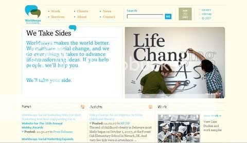
http://www.e-worldways.com/
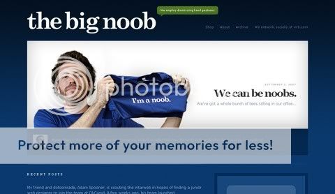
http://thebignoob.com/
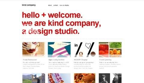
http://kindcompany.com/
http://sprawsm.com/
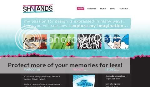
http://www.shylands.com/explore/
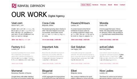
http://rainfall-daffinson.com/
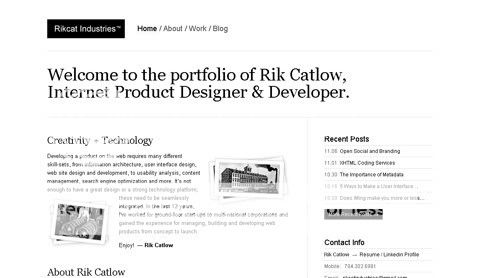
http://www.rikcatindustries.com/
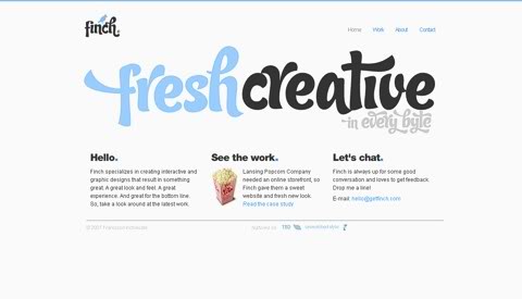
http://www.getfinch.com/
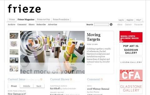
http://www.frieze.com/magazine/
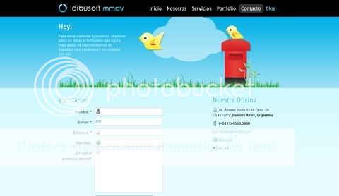
http://dibusoft.com/contact
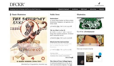
http://dfckr.com/
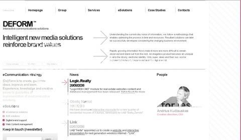
http://www.deform-group.com/
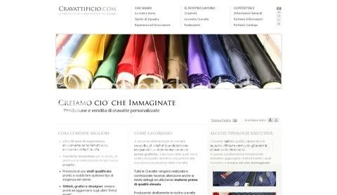
http://www.cravattificio.com/
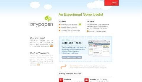
http://artypapers.com/
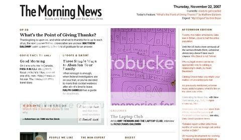
http://www.themorningnews.org/
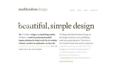
http://www.markboultondesign.com/

Great selection.
Been reading your feeds since few. Very interesting. Keep posting please…
i love the big noob site. But the arty papers one is pretty good too
The big noob site is one of my favorites :). Also the Fresh Creative.
I have not seen some of these before. Good finds!
That’s so beautyful
Simple & elegance d-sign but still keep the consept
The beauty is that they very simple yet attractive and navigable.
Love the big noob one. Nice on the blue background. very impressive yet simple. Well done.
Great resource. Thank you for sharing.
Slick and clean collection!