
A trend always appears as opposition to another. Detailed Gothic art was replaced with the pure straight lines from Greek temples in the Renaissance. The tons of hair spray, glitter and multicolor spandex 80’s were demolished by the black & white minimalism from the 90’s.
The web is no exception. In the beginning, there was no light on the web. It was awfully crowded, with dancing marquees, tedious frames, unbearable midis and annoying spinning @’s. It was the dark ages of the web. Then came refreshing empty spaces, vibrant, high contrast colors, lovely gradients, big text, original gloss shine effect, diagonal lines and, of course, reflected logos, came t0 our rescue. Everything was shiny, with that great ‘breand new’ smell. The Web 2.0 look was born.
But guess what?
There are some people getting tired of that. Call them revolutionaries, or trend setters. I call them visionaries. Elliot Jay Stocks is my new hero. He took part in The Future of Web Design event, held in NY, with a talk called “Destroy The Web 2.0 Look.”
In his talk, he demonstrates how the current web style is overdone, making sites look like Dollies (cloned sheep). Mr. Stocks also notes that what makes a site part of the Web 2.0 wave is not the way it looks, but the way it works. He shows how the “Web 2.0” is not about aesthetics. It has been misunderstood by the web design recruitment industry and marketers, among others, who think the look will translate into success. As a conclusion, the designer invites us to educate people on what Web 2.0 really means, and to learn from the best and try to adapt the trends to our own designs.
I agree with Elliot Jay when he recommends we adapt trends and to try and educate our clients in the matter. Also, we must agree that despite the obvious clichéd repetitions, there are some characteristics worth preserving, even in the trendiest designs: nice big text, loads of white space and centered alignment, for example.
Now, if the web 2.0 look is already dated and we have been told to destroy it, the remaining question is:
How To Destroy The Web 2.0 Look?
First let’s revisit what makes the Web 2.0 Look
- Vibrant, high contrast colors
- “Special offer” badges
- Gloss/ Sheen
- Beveled edges
- Gradients
- Diagonal Lines
- Shinny Table Reflection Effect
Now, you may agree with me that the resulting combination is an attractive, clean, and neat design, but sometimes it can be almost aseptic, or lack of personality due to its popularity.
I recommend you read an excellent post Why should your site have “personality” made by Robert, a guest blogger. Robert describes how to be honest in design, and the importance of uniqueness and how it should reflect the business’ true personality.
Then I am going to show and describe the common characteristics of some sites I believe are the answer to the cloned, aseptic web styles.
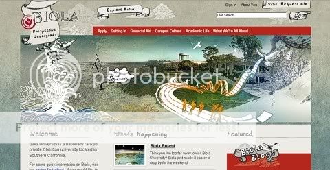
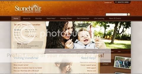
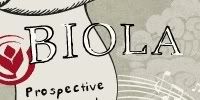
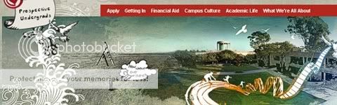
http://www.biola.edu/undergrad/
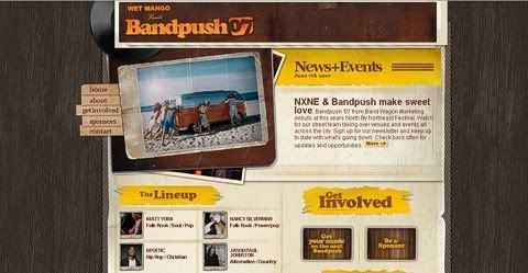
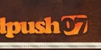
http://www.bandpush.ca/
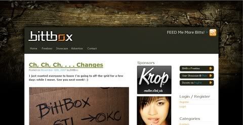
http://www.bittbox.com/
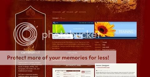
http://www.cameronmoll.com/portfolio/
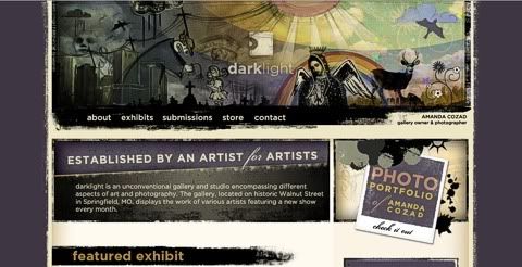
http://darklightart.com/
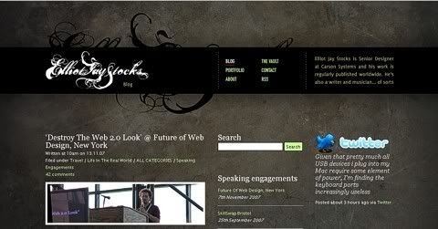
http://elliotjaystocks.com/
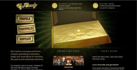
http://eyecandyanimation.com/
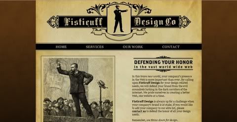
http://fisticuffdesign.com/
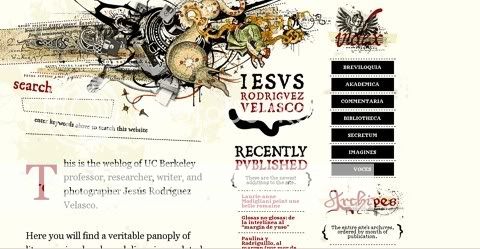
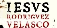
http://www.jrvelasco.com/
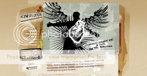
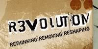
http://www.kcrevolution.org/
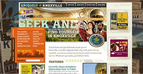
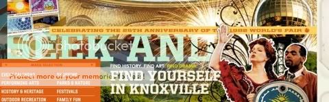
http://www.knoxville.org/
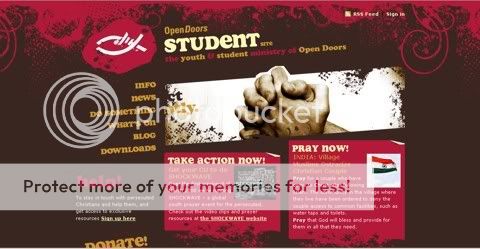
http://student.opendoorsuk.org/
http://student.opendoorsuk.org/
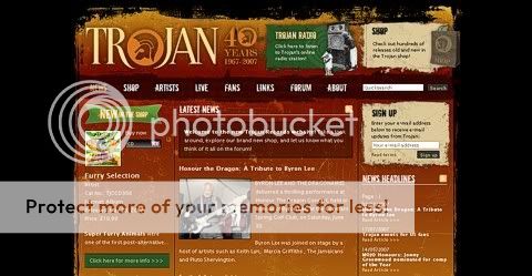
http://trojanrecords.com/
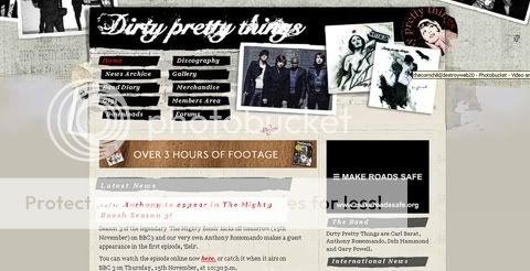
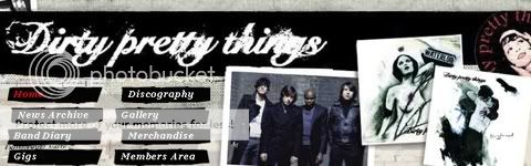
http://www.dirtyprettythingsband.com/
As you can see, these sites are the opposite of the current style. Despite this, you can still see some elements that survived, like the big text and the main layouts.
However, in their unique and trendy designs we can see common elements like the retro/vintage look, influence of grunge organic elements, and rich textures.
Let’s identify those elements again:
- Retro-Vintage
- Warm, Dark Color Palette
- Rich and Organic Textures
- Grunge-Retro Fonts
- Rough Edges
- Ornaments
- Stains
- Rich Full Layered Headers
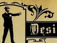
Retro-Vintage

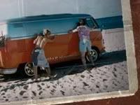

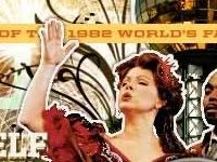
The retro elements is commonplace here, giving a cozy yet evocative feeling. Here we can see an old Polaroid photo (a very nice retro resource). Also notice the old radios in both of the samples, as well a representation of vintage printings.
Warm, Dark Color Palette
The use of dark colors, like dark brown, burgundy and mustard in lots of variations and shades is associated with that retro look. These are clearly different from the brilliant, high contrast colors of the current trend.
Rich Textures


Sometimes organic, simulating wood, stone, stained walls or vintages wallpapers.
Grunge-Retro Fonts


Say goodbye to the typical rounded-corners bold fonts we use today. Say hi to old school fonts and grunge typefaces, full of rough edges and detail.
Rough Edges


This is another grunge feature. It is the uneven finishing effect on boxes, frames or headings. Achieved by replicating the effects of ripped paper or paint splats.
Ornaments


Ornaments have been making a shy appearance on many current web 2.0 designs. But they are even more prominent in the retro designs. I particularly like the clean look of Web 2.0 with some ornaments, like floral patterns.
Stains


This is again a grunge feature, but also vintage. Adding stains like paint splatters gives the illusion of something worn by the passage of time. Something that has been used and abused, resulting in a sense of familiarity.
Rich Full Layered Headers

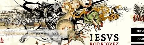
These headers are design masterpieces, not just big solid areas anymore. The many layers and objects tell a story, speaking with powerful voices about each author or the product sold.
The current web style is going to last for quite some time. But we can’t deny that there are some trend setters who are questing for their own identify, trying to avoid cliches. Of course, if this trend happens to replace the ongoing one, it will turn into a cliche as well, and then another trend will come. I think the secret is to be an early adopter and adapt each one to our needs and design angles.
nice, you probably missed http://www.webdesignerwall.com/ from ndesignstudio
Hmmm, the new thing is rich worn grunge. I thought that came before the shiny new Web-2.0 look. Guess I”ll have to dust off my 2003 site and update it 🙂
Love that look!
Great article, as a designer/developer I’m starting to get bit tired of the Web 2.0 look. I loved your examples and how you brought attention to some of the smaller (but important) details.
Thanks for the kind words, Mao. And well done, too – this is a refreshingly in-depth article about the aesthetic. Cheers!
Great article Mauricio!
I believe this is the result of a factual evaluation of today’s design from the eyes of someone who has been a real observer (and agent) of the web design evolution. I appreciate your remarks on the personality and characteristics in new web sites nowadays. I got to say I’m very pleased cause even though and into minimalism and simplicity, I did find Web 2.0 look to be a little lame and flavor-less. I totally LOVED the selection of sites you came up with to support your perspective about what we can call “the new trend” in web design.
Excellent work!
@Elliot Jay Stocks
Thanks for your comments very glad you like it :D. I admire your work and and your vision. Your topic on the conference gave me the angle I was looking for the article.
I agree that the “Web 2.0 look” is very worn out, and I find it ironic that It Is Apple’s Fault (according to Elliot Jay Stocks) but don’t you think the sites above look very similar as well?
As PXLated says, “rich worn grunge” – lots of textures, graphic elements, and maximalism as opposed to minimalism. Where is Khoi Vinh’s (which Elliot Jay Stocks happened to mention in his presentation) site?
The grungy look is not the only answer—to say it is would be like saying it is the “next Web 2.0 look”, which everyone else will imitate (if they haven’t already) even if it is inappropriate for, say, a corporate site. 🙂
All of these sites are visually gorgeous. One thing we shouldn’t forget about the now “all too popular” Web 2.0 look is that some of the original designers did something technically wonderful too – that is, they came up with a visually appealing look that didn’t eat up bandwidth, and loaded super fast (lots of repeating patterns, stripes, 1px wide gradient backgrounds, etc.).
Just something to be conscious of when designing for the web.
Great post.
These ‘new’ style sites look an awful lot like many of the music/arts sites of the late 90’s and early 2k… I remember doing using these types of elements back in 96-7 and even then they were cheesy. Think Pixies/Warp/Ninja Tunes/Shadow…etc.
Nice overview of some new styles trends. 🙂 However, I don’t believe that style=design. Design has a purpose and must meet objectives. Remember the old Form follows Function saying?
Every site has a certain audience and particular objectives which probably won’t be served by a “one size fits all” style, whether it’s what I call the “Fisher-Price web 2.0” look or the new grungy/textured/retro appearance.
That said, I still think the Fisher-Price look has its place, particularly in biz/corp sites, because it in general presents the content in an appealing and nonthreatening, focused manner. This is important to the part of the general public that might be a little intimidated by technology, and is easily distracted by overuse of textures and ornament.
Let’s face it too. The web 2.0 look can be faster to churn out than a super rich artwork intensive layout. On a practical basis I don’t think we’ll be seeing the web 2.0 look go away anytime really soon.
That said, it’s great to see more variety!
I like your critique very much. But I was hoping to see something besides the return of grunge. Maybe time to dust off my issues of Ray Gun.
Please continue posting this sort of critique and looking for new influences.
This seems to me more reactionary than revolutionary. Say what you will about the Web 2.0 style (I agree that copycatting has made much of it cliché), but at least it arose as a functional necessity. You are trying to define your style based on what Web 2.0 IS NOT, which is essentially defining based on what it IS.
The real point is your design should flow from a true understanding of product/client, its audience, and a solid sense of usability.
If I wasn’t told that these are “fresh” designs, I’d swear they came straight out of the first two years of the millennium. Anti-thesis is a recurring theme in art/design – and I know the trend cycles are getting shorter – but I never would have guessed the design cycles had wittled down to just 5 years!
Also worthy of note… compared to the Web 2.0 style, grunge draws inspiration more from other media (e.g. drawing, painting, wood texture, pen splatters). Web 2.0 styles tend to exploit techniques specific to the monitor (e.g. gradients, cartoon-like colors).
It would be interesting to see an evolution that borrows stylistic cues from other media that use additive light rather than reflective light.
Welcome to the next cliche.
i am setting up on line exams for tafe and find the page setups really un engaging and prehistoric. would love even a tenth of the aesthetic of any of the above shown images,having not done any sort of web design myself and with limited budget as well looking at this site is quite a tease. great stuff
it’s not been mentioned by you or the original poster, that “web 2.0” look is not the result of concious design process. it’s a collection of tricks that backend geeks can use to make their design not suck, without hiring a real designer. i could never execute designs like you show (nor would i want to actually), but i can write a bevel macro for photoshop in like five minutes.
another thing is that your alternatives are rigid. kind of like print design, make for nice screenshots. what i as a web developer need are ui building blocks. zeldman had an article recently, where he makes a point that web design is not like print design, but more like /type/ design. you can’t just draw something pretty in illustrator, you have to understand the mechanics of its use. http://alistapart.com/articles/understandingwebdesign
you could probably make a point that web 2.0 look comes from the situation where most designers simply misunderstand the web. we might be tired of bevels, but calling the sites that use them clones is kind of like calling mac apps clones, because they all use cocoa for ui.
Sigh…
OK, so it did not take a rocket scientist to know that there would eventually be a violent jerk away from the so-called “Web 2.0 design style”. Unfortunately the reaction is predictably manifesting itself in a very short-sided manner that does not address the root issue.
The whole problem with the Web 2.0 visual phenomenon, and all other design crazes for that matter, is that large groups of people blindly pile onto the trend without actually designing for the specific concept/project they are presented with. The solution of using styles which are the opposite of of the current trend is essentially will just simply replace what we have now with the same thing – another useless trend.
The root of the issue is that people need see styles for what they are – fleeting pop culture that will undoubtedly age very poorly. Real designers design for the particular project, not decorate something in the current “cool look”. The problem is, there is no tutorial for design process or attacking a project with creative critical thinking. However, there are plenty of tutorials in how to use Photoshop to achieve the visual flavor of the week.
I can’t wait until we have “How To Destroy The Grunge Look” articles popping up two years from now.
Good God! Those sites are car wrecks.
On the other hand, they may be ugly, but at least they’re unreadable.
The bizarre style of the piece distracted me from the author’s points. Doing an appearance? Reflected logos came on our rescue? And what is an evoking feeling? At least use complete sentences. I wanted to enjoy this and learn from it, but now I’m just irritated.
Its so good to see this conversation catching on…
Here is another similar but shorter article we posted a few weeks back:
2.0 Brand Killer
I’m with you 100%. ‘Web2.0’ is a marketing rubric. Already, we are seeing references to ‘Web3.0’. Of course, there is no Web3.0, its a marketing gimmick in its purest form.
I have links to some definitions of ‘Web2.0’ from some of the industry’s heavy breathers. Some of them are hilarious.
Thank for the tips man. I’ve found some great design inspirations here.
Nice post, but it is a bit deceiving that the examples you provide have no “social” or “web 2.0” aspect to them, which would have made it a GREAT post had you pulled off “killing the 2.0 look” on such sites. Artist portfolios and the likes (as in your examples) are generally NOT web2.0-ish in their look so the comparison doesnt quite stick as much.
Notheless, good effort on your part!
Ummmm Hope you do not mind me saying this but web 2.0 is more than just gradients and apple look alike websites. It is also about types and features on websites.
I would say that the websites you listed are ALSO examples of web 2.0 yes they may not have the gradients and apple shine BUT they are still web 2.0 styled websites with patterns, big headers, multiple headers etc
I worry that meaning of my original presentation has been misconstrued by a few people because because the Slideshare version doesn’t include my commentary (audio will be posted soon).
Some of you might be interested in my latest post, which reflects on some of the issues raised.
I am glad to see how the topic started a conversation. But I would also like you to consider some things. First the whole idea is to stop making “generic” sites whether Web 2.0, Grunge, Retro, Organic – you name it – and try to make the design reflect the content.
On the other hand, the sites shown are just a small sample of non-web 2.0 look, and due to their richness and organic features, they were nice examples of designs on the opposite direction. But there are many ways to do that.
Elliot Jay Stocks on his last post emphasizes how not to (mis)read labels and explains how they are a necessary evil in life but also we (me included) should apply them after a serious consideration.
Really like your article. Thanks. I too really fond of web 2.0. Thanks.
Interesting article showcasing some nice designs but there’s nothing new or trend-setting about them. They would be poor replacements for the ‘web 2.0 look’ as they cannot cope with the collection of dynamic objects which characterize a typical Web 2.0 page/application.
Good design is about usability and communication. Consequentially many websites quite naturally fall into the same clean, crisp style as it makes the content readable. With every revision, successful websites make their pages cleaner, more organized, more legible and usable – so that the all-important information is readily accessible. Standardized visual elements (such as RSS icons) go further to making web pages more understandable.
The web 2 look is perhaps a little boring but it is certainly not something to be avoided, unlike revisiting the grunge style or yesteryear.
Excellent article. I’ve been feeling this way towards the Web 2.0 design trends for a while. I think the reason we need to branch away from these typical Web 2.0 looks is that it’s gradually squeezing out room for creativity, and lowers the bar of quality. Diversity with quality is by far the best avenue.
It seems to me that the design trends described and diagrammed in this article make use of more urban and flourishing graphic design, and use much more serif fonts. For the most part this is an excellent thing, since it hints at professionalism and pays attention to the important things like layout structure, usability, and typography.
I’m on board, destroy the web 2.0 look. Nice.
Heh, I’ve long hated the whole Web 2.0 bit – why that name? Not only is it confusing (what with that whole disquieting ‘Internet 2″ around) but will we wake up one day and find the entire web upgraded to 2.5 to fix a few bugs?
My real issue with Web 2.0 goes past design, though: I have very mixed feelings about all those aggregators. They’ve changed net community, and made it more impersonal. RSS readers make for a different raft of new commenters each day most of whom don’t stay around, but like someone with a satellite dish and a remote control, that short attention span takes over, and they’re there one day, gone the next. On the other hand it can’t be denied RSS has brought sites better exposure, and some of the aggregators themselves, notably Stumbleupon (which I was with since its inception) have created something like stable communities themselves. But it’s not the same. I like how blogging and web-fora used to be, each site gathering its own group of “regulars” that tended to link one another. This gave me more clues to their personalities than meaningless profile details sometimes, especially since even on ‘social’ networking sites most folks can’t even be bothered to write good ones or do them at all…
I must say that I just found my new favorite article on the web. I am a current web design student. I know that I’m not into designing the “2.0” look, in fact, I don’t like it much at all. I have been trying to decide if I must adapt to that style of design if I plan on making it as a professional web designer or not. But thanks to this article, I have realized that it is quite possible to make it in the web design business of today with out going along with the trendy web 2.0 look. I this this article has greatly influenced me with my work. Thank you
~Ryan
So, the whole web is adopting the fashionistas rule: Invent once, recycle always.
That’s why I truly agree with commenter 13 (Tim): It’s reactionary… the famous people who started creating those ‘grunged’-look web sites that you listed are the same who created the ‘slim’-look web sites of yesterday (that is, if they were in the business back then). It goes the same with the fashion business.
Of course “personality” does not follows this or that layout, and you won’t need to wait some months to see what I am (and, for what it seems, many others are) talking about.
For me, people advocating this whole “new” layout idea are just like the fashionistas: they will be the first to abandon the ship once the ideas they defend start to become mainstream. And I execrate fashionistas.
For a while I thought I was the only one who wasn’t fond of the whole Web 2.0 fad/trend. I was kind of turned off from the start of it because it’s called, “Web 2.0.” The thought of giving the Web a version is just pointless. I’m aware that they gave it a version number in a figurative sense, but still…I have never been that fond in the first place. The only “Web 2.0” design I’ve come across (That I can recall at this time of night) is the Mozilla Website.
I couldn’t have said it any better than Tim did in post 13.
If you are designing to oppose a trend and not to serve your clients brand, there is a big problem with your design philosophy.
Some of these sites have a great design to them but the whole idea behind ending the 2.0 design trend is not to replace it with a new trend or cliche, it is to treat every client or design project as a new problem that needs to be solved in a way that is unique to who that client is. In some cases the glossy look might be a good fit or grunge / distressd graphics may be appropriate, but they should be used because they are the ideal way to solve the problem for that client or project not because they are the current industry trend that can be copied without much thought given.
Many have mentioned it but Rich #43 kind of summarizes…Design for the client/assignment at hand. Grunge may work for me personally but it definitely wouldn’t work for any of my clients. Of course Web-2.0 slick doesn’t necessarily either. The bottom line is design, don’t just follow a trend and decorate.
Thanks for backing up my comment PXLated. As for the comment posted by 46Sidman – you can keep a design simple and easy to use without automatically adding gradients, glossiness and reflections (purposely not calling it the 2.0 look). The idea that people think that is the only way means that we have stopped thinking for ourselves and have become sheep (see Elliot’s presentation) and if that is the case then we are doing our clients a disservice. I think we all agree that the grunge look has been around for a long time and is not new so lets stop harping on that fact and lets start advancing this conversation.
Sorry, one last comment regarding the grunge look or other trends. I find that you often find them saturating the skate and snowboard magazines before they make it to the web masses so if you want to know what the next visual trend might be flip through the pages and see what you find.
uhmmm… destroy the web 2.0 look? what’s wrong with you people… the concept behind the look is the simplicity of the site and its usability. and now you give me this “grunge” type looks and desktop clutter executions and they all look the same. look at bestwebgallery.com and you’ll see what i mean. give me different looking ones and maybe ill buy this alternative. as of now, the only alternative i see to the web 2.0 look is creating your site based on the personality you want it to convey. and com’on the samples you should me was graphic design of the late 90s. It was even present til 2004-2005. that was like 2 years ago. these people should look at the trend calendars before they try to advocate an alternative to the ugly looking web 2.0
Trends are trends, but in most cases following a trends doesn’t necessarily result in an appropriate design solution. Good graphic/brand design is about realizing a theme or style that expresses the values of the brand or entity behind the content being presented. To often designers, and specifically web designers depend on a trendy style that is easy to execute on and looks nice. Good graphic design is hard work – it’s a process of exploration, study and iteration. When done properly and thoroughly, the process reveals a unique style that is derived from the nature of the content being presented.
Perhaps if more “designers” actually went to design school instead of taking a crash course Photoshop, we’d see a lot less trends emerge online, and better graphically design web overall.
Good taste. I run a design gallery and more than half of those sites on your list were submitted which I immediately approved. Those designs are definitely top notch but come on, you can probably come up with something better than just a gallery of grunge and vintage-inspired websites?
Notice that none of the websites in the gallery are corporate sites. There is a reason why the “Web2.0” look became popular and I believe this has more to do with usability, accessibility, and achieving a clean and professional look rather than aesthetics, an area in which we both agree in..
Not to beat a dead horse but the grunge look is far from new. Flash designers and Static html designers have been using and abusing the look for years. If anything I think the next big trend in web design will be soft illustrations in combination with current more refined interface graphics.
Great article
Loved this discussion.
I do agree 2.0 is about usability
but those shiny and reflection logos can be boring sometimes.
Loved the cases too.
The look — the design–I think it goes beyond that. First there were pictures, wall drawings and “music.” Then came books, printed words. Next photography arrived on the scene. So we got books with words and pictures and later down the road books with words, pictures and music. Next stop, moving pictures–then moving pictures with words and music.
Along came radio, where words, sound and sometimes music painted pictures. Then TV, where all of the elements appear alone and together in various combinations.
Sometimes I can listen to the soundtrack of a movie and appreciate it without the pictures. Sometimes I can watch a movie with the volume off and appreciate it. But to me, the perfect movie is one where the words and the soundtrack together take the experience to the art form it was meant to be.
And that’s what’s lacking on the Web. It is a new art form, but being used much in the same way TV does — where all of the elements, and interacting with them, are together in various combinations.
We’ve not even begun to to develop the web as an art form or new way to communicate. The technology is new — we’re just cutting and pasting the old stuff up on there now.
The best is yet to come and I can’t wait.
betaBonnie
Richmond, VA
USA
Very beautiful layout examples… good post.
I appreciate the article – however, I am sad to read that what you see as a “counter-culture” to the shiny, bulgy rounded, cloned safeness, is in fact the sad old design style we just got away from – the David Carson and Tomato style that prevailed in the late 90’s, which I was extremely happy to get away from. Back then everybody did circles, stains, handmade fonts and cut’n paste. I feel that all your examples came out of the same meat-grinder, they have the same predictable uniformity of today’s cloned “2.0” look. And it doesn’t feel new, and since they all blend in with eachother, none of them (with a few exeptions) don’t really stand out and have their own personality.
I think the strongest online presences are levels above the formulaic design template you describe – they are all very strongly rooted in extreme personal expression, that comes out of using whatever design tricks are necessary to make things work the best. Discarding rounded fonts because it is too “web 2.0” to me is not really the answer – if rounded fonts seem to ork the best in what you are trying to achieve – similarly centering text is often seen as the non-designers cop-out for fool-proof typographic treatment, and that doesn’t really necessarily work in whatever context you might working in..
Personally, for myself, I think the new cool is working with microscopic grain and texture – really subtle details in your design that make it tactile, but still calm – a movement from the bevelled shine, but still away from the dull flatness of artschool, Swiss-style typo-led minimalism. And certainly a move away from faux-treatments like scanned splatter and messy grime.
Thanks for this article and the wonderful examples. The web 2.0 “look” is indeed tired, and its great to see that not only designers, but even churches create their sites with a more grungy look now.
68 Jacob…get a grip!
The reason why Web 2.0 became so popular was not really the marketers, it was the lazy designers.
Making one of these sites looks like a hella lot of work, whereas making a Web 2.0 site is not, it is a bland me too type of design, which anyone can put together.
And that is why it will be around for a loooong time.
Being a big fan of classic web design, I am not very interested in the Web 2.0 designs. The glassy look is too “bubblegum” for me and the pages don’t seem to index well in the search engines. I love the look of most of the pages posted here though. I would also be interested in checking out the load times for these pages to see if they load as well as they look.
This is the future of webdesign. This is Web 3.0.
Please tell me that #76 Bernhard Bohnenkamp is being sarcastic with his following remark…
“This is the future of webdesign. This is Web 3.0.”
The idea of deconstructing/destroying/marring a web 2.0 design is a really ingenious one. Great examples, tons of really cool designs. Thanks for the ideas.
wow..that is sooo cool. i love the design
You’re late, the grunge style was right before the rounded corners came up, every teenager designed his personal website like that. That was also the reason why the grunge style disappeared: it was overdone. Also, nice way to show us your favourite websites…
Well put 84 Deof
“Robert describes how to be honest in design and the importance of uniqueness and how it should reflect the business true personality.”
A cloned “anti-aseptic” look is just as imitative as a cloned “aseptic” look. It reminds me of “non-conformists” who get piercings and/or tattoos simply to be like their friends or “free-thinkers” who blindly believe whatever the latest popular skeptic tells them. Not that I have anything against imitation per se, but it should reflect intelligent, conscious decision rather than merely following the latest trend regardless of whether that trend is Web 2.0, “anti-Web 2.0”, or whatever.
some of the examples fit the purpose and tone of the content, and yes, a bland ‘standard’ web look is not good, whether “2.0” or earlier
but most websites, personal and business fail in some basic ways, starting with usability
also usability
and then there’s usability, which most websites seriously fail at
putting way too much attention ton ‘slick’ or ‘arty’ is a waste of time, energy, and bandwidth, and usability usually suffers
simple is good
usable and simple is better
No more 1 color logo with one letter in other color and beta below.
Regards!
The pages you are showing here are based on grunge elements. And that was the trend just before Web2.0-style came up. You try to destroy the actual trend with an older one.
Some of those retro-grunge designs are pretty cool, but they like the shiny gradients of web 2.0 will look very dated, very quickly, if not sooner.
db
maybe the author of this post is too young to remember, but all this ripped-up, spray-painted, stained, torn, slashed, and burned stuff was popular just about 10 years ago in print and also on the web. this is not destroying anything. it’s just going back to the sloppy, messy stuff that the clean and simple crowd was trying to replace.
Great inspiration! Fits more to my personal preferences than the slightly anti-septic web2.0 style.
Thank you for taking up the issue and collecting the samples!
Great article. I completely agree with you. One should follow one’s own needs and use trends as an inspirtion in search of identity.
Well, nothing new. Back to grunge, eh? I’d say let’s not go back several years but maybe several decades? 60-70th retro look is much fresher that this. So I’d vote for that retro-vintage.
…or even better… something ENTIRELY NEW and never seen before?
Amazing article and tips. The websites you have talked about all look so artistic and beautiful. 😀
such a genius article and I read it so late!
well done mao, as always a very good read
A very good compilation!
it’s very cool. let me try.
OK, so you are replacing:
* Vibrant, high contrast colors
* “Special offer” badges
* Gloss/ Sheen
* Bevelled edges
* Gradients
* Diagonal Lines
* Shinny Table Reflection Effect
with:
* Retro-Vintage
* Warm Dark Color Palette
* Rich and Organic Textures
* Grunge-Retro Fonts
* Rough Edges
* Ornaments
* Stains
* Rich Full Layered Headers
Maybe you could call it the Web 2.1 look??
I hate to think of design as just pretty graphics. I think designers should believe they do more than that for us to have real innovation in the things we use.
Hi, great article – reall enjoyed rading it, and also it helped with putting together some thoughts concerning some jobs I’m trying to finish at the moment.
Best greetings and keep up
tartanproject.com
Amazing artistic view, it’s really great to get in touch with foreseen stuff. Very cool
Its difficult to find someone who is is gifted as both a designer and developer – not to mention, a Visionary, or Revolutionary!! I’d like to be, but one without the other is really nothing at all.
great article!
Nice article, although I’m no fancy webdesigner and build my sites with old fashioned HTML codes, but they are defenitely ‘retro’ 😉
In the article i kind of missed the ‘throw mess on the page’ technique, like a coin, a burned match, stains etc.
Also I love adding frilly 1930s white borders to my photos.
Well said. Too much gradient… the torn paper, grunge, and visually intense designs can be much more stimulating. I do fear however, that many people find the soothing, chubby, rounded look of Web 2.0 comfortable!
I’m totally on board, destroy the web 2.0 look. Nice.
wow, what a flash back to circa 1995 when we built our first company website using pieces of paper and coffee circles, trying to get away from the stark white or grey backgrounds that most sites had back then.
Then of course a few years later when adding the rough black edges around photos to make them look like they had actually been developed and werent just digitals…
come on guys, if this isnt the future of design it is the past…
I believe that nobody can dictate the rules to make web! as I am convinced that nobody can dictate rules in art, I come first of all from the world of art and then I approached the web, and I know that art loves the personality of the artist, as it is singular and unique, create rules in making art, means kill her, and so for the web..
Diego
All these designs are as similar to each other as the slick web 2.0 designs, just uglier.
cool blog, I really like how you have gone into such detail about each aspect and characteristic of the new 2.0 design.
Alot of people see this new look as quickly becoming another designer cliche. however I really like the majority of it, like the shiny gloss appearance and the vibrant contrasting, colours. In all the personal or ‘fun’ websites I make I tend to go with a ‘retro look’ and full blown headers, but rarely get the chance to design a web where you get to add characteristics due to mainly working with corporate clients.
I can only hope that this look won’t just become another cliche.
Thanks
The way “Web 2.0” sites are created makes them quick to load and very easy to manipulate due to the various building blocks they are made of.
“Web 2.0” sites are simple, bold and obvious. They are designed to flow. Big arty banners and grunge just distracts the eyes and makes you look at the minor details.
A “Web 2.0” site will often make a subtitle larger than the branding. The subtitle says “need help?” or something such message. That’s because to an end user, your logo and imagery is an irrelevance.
The user is on the site to find something. So you make the important parts the most impacting. Clever positioning and impact will cause the user’s eyes to flow along the page in a certain pattern. Art follows this principle, and all art needs focal points.
The sites you’ve given examples of look pretty… But most of them have an irrelevant focal point or none at all… So even as art they fail to make the bill…
The internet is not an art competition, it is a source of information…
I do like the DarkLight and Elliot Jay Stocks sites though…
an excellent list, i am just in the process of designing a new site, im gonna stick it to web 2.0. my corporate company has shaped me and im gonna fight it. Watch this space.
Seems to me that you’re promoting a switch from web 2.0 design to just another cliche direction with textures and grunge brushes, beause that’s what all your exmaples have in common…sigh
Everyone goes around saying web 2.0 logo, web 2.0 logo, but really web 2.0 logo means style of logo that is designed from a web2.0 (Social site)
Nice Post!
I would take the Glossy Web 2.0 Look, over this “Grungy” rubbish anyday.
This is old……… organic has no place in a digital medium.
Organic as far is this torn-pissed-on-paper look above.
THINK CLEAN! THINK SHARP!
Onyx is right. The whole idea of web 2.0 designs is about expressing yourself as a web designer, it’s about serving the visitor, whether it by looks or features.
Most of the designs that are promoted here are just total clutter.
Mind you, I’m saying this as an artist, who likes to draw and paint every day and who even has a popular related web site.
Web designers should stop thinking about their ego first. It’s pretty sad when we have those tons of sites with design galleries that only compare looks and most definitely NOT functionality. For years they have been designing for “looks” and now we see a trend in the right directions and suddenly we’re going to promote that old stuff again? And if you can’t design a web site, regardless of what web 2.0 standards stand for, that is fast, easy to navigate, not cluttered, etc, then you shouldn’t be a designer to being with!
All these sites have really good design styles, the web 2.0 look in my eyes isn’t completely future proof though.
Pitty bittbox has ditched the grunge look :-/ Starting to look a little smashingmag like…
Excellent, you know the web 2.0 look promised so much and im a big fan. It time that web 2.0 is brought back. keep a look out for my company site. re-design coming soon, web 2.0 in mind. (www.crearecommunications.co.uk)
What’s old is new. Web 2.0 look came about from the abundance and overuse of “paint splat” effects.
Following all these “tips’ again will just lead to a bunch of sites that look like 2000 all over again!
The fact that people are all happy about this new kewl “grunge” look is baffling!
Maybe I am old, but I was around during the first wave of “grunge” and it mercifully is gone.
Last I checked, good web design is readability, ease of use and communicates the need of the client. All this wankery over ripped edges and retro fonts is more appalling than web 2.0’s mantra of clean and simple.
It all about incorporating high levels of graphic design with modern social network friendly functionality.
Keep up the good work.
Awesome. Talk about a How-To guide to pretty sites. Delicious-ed!
What do you SERIOUSLY think of my header? Is it too simple? Is it innovative? Do you like the way that it blends with the background? (IE7 or above, or another browser like FF)? Seriously, what do you think?
i think you completely misunderstood this presentation. you’re still referring to the web two point oh look. jesus.
very good… Thanks you very much !
The whole versioning thing is ridiculous. There is no 1.0, 2.0, 3.0. It’s all marketing. Rounded corners and reflections have nothing to do with so-called 2.0… it’s just a design trend… like the dreaded Kai Page Curl from the ’90’s (Web Beta 0.9?) or the David Carson layered and destroyed look of Ray Gun. Design should always strive to be a unique solution to a unique problem. Style is a crutch for those who lack creativity.
I’m totally on board, destroy the web 2.0 look. Nice.
Really interesting article, shame that your photobucket account has exceeded its bandwidth though. I agree with you, that web 2.0 is more than just looks it’s also the way it functions.
great examples, but the content and usability still has to be there!
great examples of web 2.0 design, shame that all the photos are down..
Yeah, welcome to the 3.0 trend.
Simply replacing a trend with another one.
Please make your style fit your website’s goals and strategy, not the other way around.
21 P.J. Onori, sums up my thoughts
I love this article. It is tragic how quickly trends cycle through different styles and how quickly some designers over-saturate the web with horrible recreations of it. It really ruins it for the trend-setters. I salute you.
@nickwichman
nice compilation. But you got the wrong adress for the stone briar church site wirtten.
Just to let u know 😉
greetz tim
@Tim Thanks for let me know
I loved this write up and I hope you don’t mind me passing it along. Here is something I think you will like and laugh at.
Pete
http://twitpic.com/g36mk/full
@Pete Very good mate! a template of templates!
I agree with Thijs Visser!!!
Superb post and an awesome collection. I liked “Elliotjaystocks” template. Many thanks for sharing this useful resource. Kudos 🙂
We really can’t disregard the impact of Web 2.0 of today. As such we must appreciate such and never destroy it in a way. Maximizing its full potential is one way to go.
We are looking for a web 2.0 destroyer on a budget, anyone can help?
I like this article..1st time to this website. Thanks for sharing. I have to revisit this website. I was a room decorator for five years. My decorating tip of the day is this: Please don’t overdecor a home. Room flow is a must. Thank you once again.
It is tragic how quickly trends cycle through different styles and how quickly some designers over-saturate the web with horrible recreations of it.
@Andy it is tragic, to see how the trendsetters envision an aesthetics and the followers just replicate it ad infinitum w/o adding anything of value.
Yes, You can definitly crash whole web 2.0 site with to much contracts.
Definetly agreed, the “new” WEB 2.0 design looks like the old 90`s websites, no real design, just texts.
Hey! I could have sworn I’ve been to this website before but after checking via some of the post I realized it’s new to me. Anyhow, I’m definitely happy I found it as well as I’ll be bookmarking as well as checking back frequently!
a useful connection sharing has been a very nice thank you
Destroy web 2.0 look seems to be a great idea!
alot of the 2.0 sites have to much going on.
Why to destroy Web 2.0? There is no another way to disable it?
The best look is when there is no rules… I think its like colors and clothes. Everybody do what he want!
Thanks for sharing lots of very useful information
I always believe that web designs should really depict the personalities of the companies and individuals they are representing. But as it is, many websites lack the wow factor due to the fact that the designs sticks to the trend.
wow, what a graveyard this has become. it’s interesting to go through these links only to see how companies have bleached their websites of all the life and personality they once had. it’s also jarring to see how a style of internet that is now sought after was (to some extent) reviled and challenged in it’s time. now we are left with a cold internet, with not a fixture or finish to be found