

Why are they important to your business, and how to build a great one that converts?
But first, what is a landing page? – Know the facts
According to Google analytics glossary:
The first page a visitor views during a session; also known as the entrance page.
And according to Wikipedia:
In online marketing, a landing page, sometimes known as a “lead capture page” or a “lander”, is a single web page that appears in response to clicking on a search engine optimized search result or an online advertisement. The landing page will usually display directed sales copy that is a logical extension of the advertisement, search result or link.
We can see that we have two definitions of the subject; the first one references an initial page a visitor sees during its session and the second one explains it as a single page you get after clicking on a link that is part of a marketing effort in order to obtain a lead or a sale.
I must say that the initial approach is a faulty one; the first page you see when you enter a site is an entrance page — the entry point for a user of your site. You can make the most of out of it by turning it into a landing page and convert those visits into sales or leads. That leads us to the second approach mentioned by Wikipedia which is a more accurate definition of a landing page. I would add that it could be a single web page (or a set of them) conceived to convey a unique experience based on a marketing campaign strategy.
Keeping that in mind, it means that if you buy PPC (Pay Per Click Advertising) you will create a landing page or a set of them and its main purpose will be to create added value to any visitor who clicks on the ads. I believe that a set of landing pages performs better. That way you can control the path that the user must take to convert. When you offer a single landing page with all the headlines, the call-to-actions links, and the fill-out forms. It screams in your face a desperate message: GIVE ME YOUR DATA TO CONTACT YOU!. In contrast, a set of landing pages (no more than three) allows the visitor to continue along the funnel, showing its interest before finally converting.
In short, a Landing Page is a special web page designed to present a product, service or feature. There, the visitor will get suffice information in a fast and easy manner.
In short, a Landing Page is a special web page designed to present a product, service or feature. There, the visitor will get suffice information in a fast and easy manner. That’s why in many cases a Landing page it is more efficient than a homepage. A homepage is cluttered with navigation bars, images, and options that will distract visitors from their task to find the particular product they want. This distracts them from their decision to buy, makes them lose interest and even gets them frustrated.
A common bad practice when companies buy PPC advertising is to determine which is the top entrance page of your site using Google analytics. Furthermore, send lots of unaware potential customer to land in the middle of your website, without any compelling headlines, nor sales speech, or call to actions.The visitor ends completely frustrated without clear directions and marketing goals to achieve.
So, Why is a landing page important? – Where is the beef?
I love metaphors, it’s the best way to imagine any subject no matter its complexity. Let’s say you are going on a trip. Let’s say you have never been to Space Mountain, I know, I know, is an oldie but goodie. Well, imagine you finally find the best deal, the best bang for your buck that will get you there fast and cheap. Isn’t that lovely? So, you start packing, making your lists, charging your camera and buying some sunscreen.
Finally, you are on your way, full of anticipation for your dream that is about to come true. And then, the horror, these amazing people you trusted and follow to help you materialize your dream, leave you all by yourself in the middle of a humongous parking lot to find your precious Scape Mountain by your own means. How do you like it now? Wouldn’t be amazing if those guys, the one you have trusted in the first place, take you directly to the right destination? Saving you all the frustration and distractions. Arriving with the best mood to enjoy and have the best memories. Well, the same applies to every one of your customers. Wouldn’t it be splendid to reach your goal faster and hassle-free? Uh? Sure, that’s a big resounding, yes!
Today, we as costumers are immersed in a vast ocean of information sources, an endless stream of never-ending content fighting for our attention, so it is no hard to imagine our potential buyers engulfed, buried, asphyxiated by all that. That’s why so many efforts are done to create a solid web presence for any product or service. Among all the refinements to be done to polish the product itself. There are also lots of efforts in brand awareness and effective digital marketing.
The deepest desire of users is just one thing: to land on the very specific page that will provide all the information they want, fast and easy.
And that’s exactly what a landing page delivers. When a visitor gets the info of a product, service or feature via an external source: Ad, email, social media, etc. and clicks to go to the source, obviously, this potential client does not fantasies about spending precious minutes of his time rambling among the interminable options and information offered by your homepage. The deepest desire of users is just one thing: to land on the very specific page that will provide all the information they want, fast and easy. Information that would help his decision-making process. So, with that in mind, crafting a well-thought-out landing page is fundamental to pump your marketing arsenal and skyrocket your conversion rates.
How to build a killer Landing page for free, using WIX. – Let’s do this!
Now that you know the basics of what a landing page is, and why it is fundamental part of marketing, we should get our hands dirty. Well, not literally. 🙂
Wix doesn’t need much introduction. They have been around for quite some time with their stellar service, they really know how to make a website quick, simple and beautiful, including landing pages of course!. And for those new to the service, Wix is a powerful html5 website builder for free, you can always upgrade to the premium as well. But their freemium service is awesome, really. To find more tips on how to create a great free landing page check out this post.
Now, what are the steps? Enter to you Wix account — otherwise, create your account for free. Then once you are in your dashboard go to My Sites then create a new site, scroll down to the bottom of the categories (they have a plethora of them!) and you will find the Landing pages templates.
There are 3 subcategories: Coming Soon, Launch and Campaign. Those cover most of your lander needs but remember you can make your own from scratch and also customize it as far as you can without writing a single line of code.
Once you have your hands on your template, I will give you tips to maximize your landing page effectiveness.
Before we start. Here is a really useful video on how to make a website in 11 steps. After all, landing pages are simply focused websites.
1 Make your text Scannable. – Short paragraphs and bullet points.
All content for the web must be easy to digest — unless you are reading a scientific magazine. It should have a recognizable information hierarchy: You should easily distinguish which information is more important than the rest, what you should read first. To achieve that you must use:
- Headings
- Subheadings
- Photographs
- And most important bullet points. They are the best way to serve bite-size information.
2 Use your own photographs — No more cocky stock photos, please.

It is very easy to spot a stock photo. You know them. You know you hate them. Make it stop. Take the time to take a nice photo, a real one. You will get more trust and respect by showing the real thing, not some group people with empty expressions and tacky business clothes. Your visitors will immediately connect with the brand and with your product. I know, everyone would love to have a headquarters inside a skyscraper in NY, full of blondes wearing suits and smiling. But believe me, those tacky photos are not fooling anyone.
3. Include an explainer video on your landing page. — Communicate lots of info in seconds
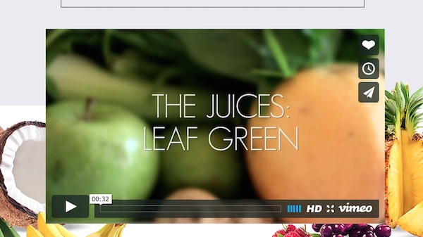
Explainer videos are gaining a lot of popularity every day. They are becoming ubiquitous. Brief videos, that shows in a short period of time, lots of information; otherwise tedious to convey to your visitor. That’s why they convert so well on landers. They increase the trust of the client on your product because they get to you know it intensely in a matter of seconds.
4. Be specific in your CTA (Call To Actions) – Be more compelling being specific
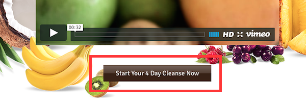
Calls to actions are essential for any web page, especially for landing pages where you are guiding your visitor trough a funnel process. So CTAs are the articulators of that guided tour, that’s why they must be clearly defined. For example, if you are filling out a form asking for a quote on a juice cleanse program. Instead of “Send” it will be more informative and will convert better to say “Get my juice cleanse pricing now!”.
5. Restrain the number of form fields — Cut the crap, get more leads
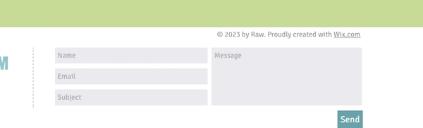
I believe this is self-explanatory. Nobody enjoys filling out web forms. I repeat, nobody. A never-ending form, with field after field, is one of the most frustrating tasks you can experience on the web. All the data to fill in. It could only translate in frustration, losing sales. For that matter, please limit your forms to no more than 4 fields or less.
6. Communicate the benefits, not features. — Don´t merely describe your product.
Features are for user manuals. Lots of bullets point describing a long list of attributes and aspects of the product. That is not intended to sell, when you read a manual you have already acquire the product and those features will help you to know it better and get the most out it. But when you are trying to sell something it needs another approach. What the product will do for your client.
7. Exclude navigation bars — Don’t distract your visitor from the main goal.
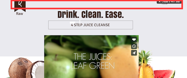
This is one the easiest strategies to put into practice in any landing page. Remember all of them need to have one clear focus: Convert, into sales or leads. That’s why you must keep your visitor on rails. So they don´t get distracted and go elsewhere on your web page.
8. Include a countdown timer for especial events – Create a sense of urgency

Countdown timers are a really effective way to create a feeling of urgency. You got to hurry or the Nostromo ship will explode and you have to catch your escape pod, but don´t forget your cat!. Countdowns must be short, less than 15 days. No one will be in a hurry if you set it for 30 weeks.
Conclusion
I hope you take into practice all these concepts and execute them on your future landing page. Don’t forget, keep your visitor’s focus on the task, don’t saturate it with info or directions, be as specific as possible, sell the benefits, get rid of the nav bar, keep the forms short and for the love of god don’t use stock photos!