
This Color Theory 101 is a practical guide for designers to help them understand better this complex and so important subject. This article is not too technical, we’re going to study colors in an applicable way, talking about how do they work, color characteristics, additive and subtractive color, color harmonies and resources.
COLOR AND LIGHT
We can say that color is basically a matter of light. Without light there’s no color. So, how does it work and how can we see colors? First, white light contains all the visible spectrum colors. It means that these colors together, with the same intensities, make the white. The light from the sun, for example, is a white light. We can see that it’s made from all the colors in the rainbow, when the sunlight is decomposed.
Take a look below at how the light and colors work:
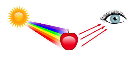
– The white light from the sun reaches the object.
– All the colors are absorbed, except the red.
– The red is the color that we see.
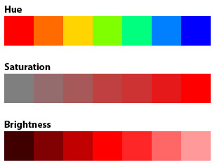
HUE, SATURATION AND BRIGHTNESS
There are three main characteristics that can define color: Hue, Saturation and Brightness. The hue is the color itself, as you can see the variations in the image below. The saturation refers to the amount of color that distances it from the gray (a grayscale image, for example, is fully unsaturated). The brightness refers to the amount of black or white in the color. This is how the HSB system works, based on these values to create any color.
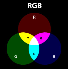
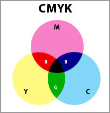
ADDITIVE AND SUBTRACTIVE COLOR
We can work with these two color models, each one, for its own purposes. The additive model is based on mixing the light, while the subtractive model is based on mixing the pigments. In a simple way, we work with the additive model (RGB) when preparing contents to be displayed on tv, internet, mobile or any light source. When working for printing, we work with the subtractive model (CMYK).
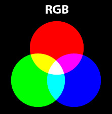
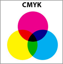
Notice something interesting: the mixing of RGB creates CMY colors, while the mixing of CMY creates RGB colors. And again, the mixing of light colors creates white and the mixing of pigment colors create black.
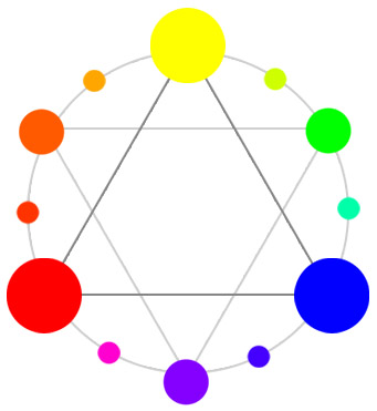
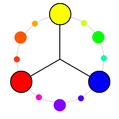
COLOR WHEEL
The color wheel is the circular organization of colors according to hue. This representation is based on the primary colors (according to the standard color wheel: RYB) and shows the mixing between them.
The image shows a simple color wheel that will guide us when talking about color harmonies. Attention to the primary, secondary and tertiary colors in different sizes.
COLOR HARMONIES
Let’s see some of the combinations that we call harmonies. They tend to compose a good combination, but, of course, any project has its particularities.
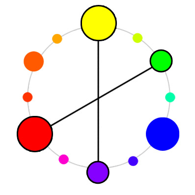
Complementary Colors
The complementary color makes a high contrast layout, use carefully.
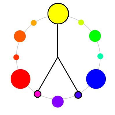
Double Complementary
Double Complementary
Analogous
The analogous harmony has a low contrast and makes a softer pallete.
Analogous with complementary

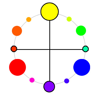
Tetrad
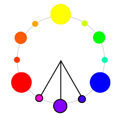
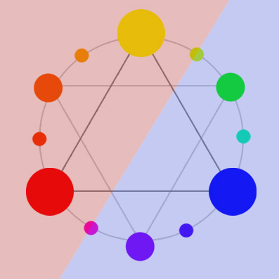
Triad
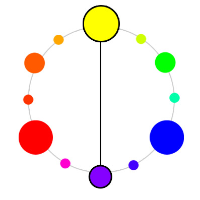
WARM AND COOL COLORS
We can separate colors in warm and cool. The warm colors are the ones close to orange, red and yellow. The cool ones are next to blue, violet and green. The image shows the “line” between them. Adding warm colors make the layout more cozy, happy and vibrant, while using cool colors make it more cold, serious and formal.
RESOURCES AND TOOLS
Colour Lovers
Community for color inspiration

Kuler
Adobe’s tool for creating and sharing color palettes
Color Blender
Create color palettes online
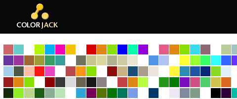
Color Jack (Studio , Galaxy and Sphere)
Three different tools for creating color schemes
Colourmod
DHTML color picker

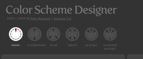
Color scheme designer
Color palette genarator according to various harmonies
Color Schemer
An application that works suggesting combinations for you
Daily Color Scheme
Every day with a new beautiful color scheme

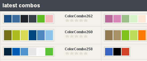
Color Combos
Browse through lots of combinations from the library
Colorblind Web Page Filter

See any website as a color-blind person would see it

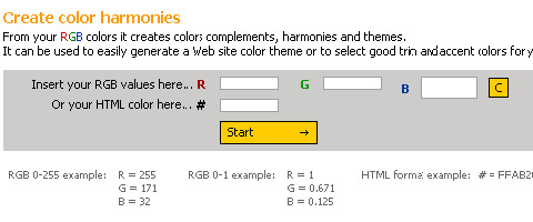
Easy RGB
Create color harmonies based on RGB values
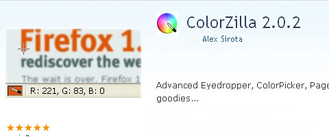
ColorZilla
Firefox add-on for designers, with handy tools
LINKS
How to use color in logo design
Color perception
What’s your favorite colour
Test your Color IQ
I liked this article very much made me remember my color theory classes when studiying Graphic Design, thanks for sharing!
@magali Thanks magali, thats the whole idea to provide like some sort of handbooks of some design concepts 🙂
good work on color. i need some more detail.give me earlier.
thanks
BOO! It needs more detail and needs to be printable!!!!!!!!
i agree
Thanks for your tutorial here.. My friend said that I’m so awful in harmonizating colors. But now I get basic idea with the Color Wheel:)
@Addicting Games. Match a color palette can be a very challenging task. It takes a lot of training but surely the color wheel is such a big help 🙂
Great resource for presenting color to third graders! I wanted to incorporate RGB and CMYK since more kids are now exposed to computers and printers at home, but I didn’t want to stray too far from the traditional color wheel. This article was extremely helpful, easy to read, and informative.
@xpinkerton Glad you found it as a nice source of info for your boys and girls. 😀
I loved the way you explain this, It’s very easy to understand especially for the beginners. I’m also one of the Colour Lovers community.
Very simply explained! well done on that. Too often these concepts are misunderstood.
Evil winged monkeys with cymbals? Now, that would make an interesting subject for a sketch.
Really Appreciable Explanation
Visit http://www.activecomputech.com/vector-graphics.html for cool vectors absolutely free
Since when is brown a neutral? Gray or black is neutral, not brown.
Red, yellow and blue are not the primary colors. They mix to brown, all oppositions on this very outdated color wheel mix to brown.
Do you want to mix red? Combine transparent magenta and transparent cyan, How about mixing blue, combine transparent magenta with cyan.
It’s very easy, the true primary colors are transparent yellow, magenta and cyan.
http://www.realcolorwheel.com/rcwchartoppmap.htm
Don’t be fooled by old technology.
@Don Jusko hey! thanks! mmm great insight
Creating colors on line is not a very accurate way to get to the color of tint that you desire. If your screen is not calibrated, which 99% of the screens are not, it’s just an exercise in futility.
rbg is the true color wheel, three receptors in our eyes for human being rbg is it blue heaven coming unifiy, red hell seperating leaving, green earth stationary living…back is not neutral..brown is dirt trunk dead cells stationary
@jim you are so right. Nice insight 🙂
RGB primary is for Light, it’s secondary in Pigments. In pigments, the primary colors are transparent yellow, magenta and cyan. They will mix any color you see.