We are going to talk about one of the most important areas of design: logo design. Certainly, there are lots of things to discuss here, this subject is really complex. In this article we are going to cover the main aspects, showing the importance of a good logo, giving you tips and also a collection for your inspiration.
Why is it important?
Nowadays, everyone comprehends that a logo is needed, but not everyone sees that a GOOD logo is needed. Any business has a logo, but many people think that it’s just a drawing to put on your business card. The fact is that a good logo stands the company out from the opponents, adding the right ideas and values to your business. A well-designed logo is a memorable, easy understanding and works in one color, among other attributes.
To see this applied in real life, let’s consider some cases. Take a look at these three shapes:

I’m sure everyone can tell me which company each of these symbols represents. They are so memorable that even part of it can tell us what it represents. There were no word in the image and you could “read” the message. Taking it a little bit further, now take a look at this one:

In this case, the interesting thing is that anyone recognizes this wave shape as something related to The Coca-Cola Company, but this shape is not the logo, it’s actually part of Coke’s visual identification. The colors and shapes are significant that they are enough to carry the message. This is the impact that a good project has to cause.
Tips – What to do
- We have some tips to help you create a logo. You can see our complete article about the creative process here.
- The first thing to do after the design brief is a research. Look for other logos in the same area, find good references and learn about the company and its concurrence.
- You must understand what the customers expect to create the right concept.
- Start sketching, experimenting and exploring.
- One important aspect of the result is that it should be simple and effective.
- Use as fewer colors as you can, to amplify the uses for different mediums.
- Be sure that it can be reduced at small sizes without legibility loss.
- Your final result should be a vector file, the logo might be used in big sizes too.
Tips – What not to do
Take a look at these examples below. They are cheap logo designs sold on the internet. There’s a huge difference between these and a professional logo. Let’s see some of the main aspects that make a bad project.
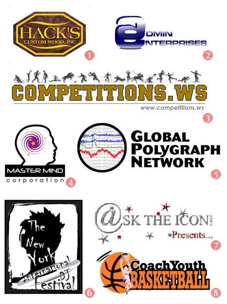
- Textures
The use of textures on the logo is not well accepted, at last, the final file of a logo should be a vector. - Gradients and letter interlacing
Simple gradients do not have a good aspect in a logo, especially the ones with white. Letter interlacing has no meaning in some cases. - Too many elements
A logo has to be the synthesis of the ideas. The simpler, the better. - Known software tools
Simple shapes made with common effects are easily recognized. As each project should be unique, these ordinary shapes aren’t a good choice. - Small parts
The logos should be scalable, bigger or smaller. Too small parts disappear when reduced. - Free/common/overused fonts and disperse text
Overused fonts like Chiller (although this one is not free) are not well seen. Besides that, this logo seems more like a layout, with that disperse words. - “Bevel and Emboss” effect and the use of “@”
Photoshop simple effects like the “Bevel and Emboss” look amateur. The use of “@” without a context does not make sense. I’ve seen a lot of logos with “@” for companies that don’t even have a website. - Literal representation
The concept is the differential between a professional logo and an amateur one. The literal representation, especially using drawings or clip art shows incapability for creating original ideas.
Links
Here goes a list of selected websites, articles and tutorials full of information about logo design.
Web Sites/Blogs
- Logo Design Love
- Logo Lounge
- Logo Orange
- Creative Latitude
- Just Creative Design
- Under Consideration
- Blog-oMotives
Inspiration
Articles
- 10 Successful logo redesigns
- Ambigram logos
- How to choose a logo designer
- Why logo design does not cost 5 dollars
- 10 Principles of the logo design masters
- 30 Brilliant vector logo designs desconstructed
- The logos of web 2.0
- Logos with a meaning
- How NOT To Design A Logo
- Branding is Not a Science is it?
- Brand New: Opinions on Corporate and Brand Identity Work
- The Ultimate Step-By-Step Guide to Logo Design
Tutorials
- Dissecting the Logo Design Creation Process
- The logo design process for ultimate potential
- Creating crazy cool logo
- Creating a logo – The process
- Logo design project step by step
- How to design a logotype from conception to completition
Inspiration
For last, we’ve selected some clever, beautiful and effective logos for your inspiration.














Thanks for sharing these designs. have you seen logopond.com ? some of the designs are really inspiring.
Great advice and resources. I can’t believe how many of those mistakes i see each day in the newspaper :/
It is always a specific formulation a repeatable and legally protectable signature!
Great collection of logos, not seen some of them before unlike most logo posts that just repeat each other!
@Tom Glad you like the post! That was the whole idea 🙂
Nice article. I have to hate on the Parallax logo, though: it’s lovely in concept, but FUGLY in execution.
Fantastic
Thanks for the resources they will come in handy, cool logos as well.
Well, I am so excited that I have found this your post because I have been searching for some information about it almost three hours.
mens waterproof jackets
Good post you got here. I appreciate the time involved in coming up such informative post. I will be coming back for more. Thanks!
Logo gives first image to the original personality.
Finally I found what I was in search of for such a long time. I am grateful for this wonderful post! It is certain that I will come back to this site once a few days to see what’s new. Keep on improving your web-site!
Thanks for the resources. Good post.